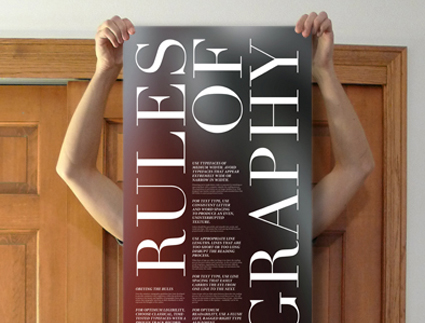
Typography is the unsung hero of the design world. It’s the art and science of arranging type to make written language legible, readable, and visually appealing. Whether you’re designing a website, creating a poster, or even writing a simple document, understanding the rules of typography is essential for effective communication. In this article, we will delve into the fundamental rules of typography that every designer, writer, and communicator should know.
- Choose the Right Typeface
The choice of typeface sets the tone and personality of your text. There are thousands of typefaces available, each with its own characteristics. When choosing a typeface, consider:
- Readability: The primary purpose of typography is to convey information, so prioritize legibility. Select typefaces that are easy to read in the context of your project.
- Appropriateness: Different typefaces convey different moods and styles. For a formal document, you might choose a serif font like Times New Roman, while a modern website might benefit from a sans-serif font like Arial.
- Consistency: Stick to one or two typefaces throughout your project to maintain a cohesive look.
- Pay Attention to Font Size and Hierarchy
Font size plays a crucial role in typography. It helps establish a visual hierarchy, guiding readers through your content. Key considerations include:
- Hierarchy: Use varying font sizes to emphasize different elements. Titles and headings should be larger and bolder than body text, creating a clear hierarchy of information.
- Line Spacing: Adjust the spacing between lines (leading) to improve readability. Generally, a line spacing of 1.2 to 1.5 times the font size is recommended.
- Legibility: Ensure that your text is neither too small nor too large. Aim for a comfortable reading size, typically between 10 and 14 points for print and 16-18 pixels for web content.
- Mind Your Alignment
Text alignment significantly affects the readability and aesthetics of your design. Common text alignments include:
- Left Alignment (Flush Left): This is the most common alignment for most languages, as it provides a consistent starting point for readers.
- Right Alignment (Flush Right): Rarely used for body text, it’s more suitable for specific design choices.
- Center Alignment: Best used for short headings or decorative text, but should be avoided for body content, as it can make the text harder to read.
- Justified Alignment: This aligns text to both the left and right margins. It can create a clean and polished look but may result in uneven spacing, so use it cautiously.
- Watch Your Line Length
The length of your lines (line length or measure) can greatly impact readability. Too short or too long lines can make reading uncomfortable. Aim for:
- 45-75 characters per line: This range is considered optimal for readability. Shorter lines can feel choppy, while longer lines may require more eye movement.
- Consider the medium: Digital content can often accommodate slightly longer lines than print. Adjust the measure accordingly.
- Maintain Consistent Spacing and Indentation
Proper spacing and indentation are essential to keep your text neat and organized. Here are some tips:
- Use Paragraph Indents: Start each paragraph with a slight indent (typically around half an inch or 1.27 cm) to visually separate them.
- Kerning: Adjust the spacing between individual letters to ensure even spacing and prevent awkward gaps or collisions.
- Tracking: Modify the overall spacing between characters to enhance readability and aesthetics. Avoid excessive tracking, which can negatively affect legibility.
- Employ Contrast Wisely
Typography isn’t just about the text itself; it’s also about how it interacts with the background and other elements. To create contrast:
- Color: Choose text colors that stand out against the background. High contrast improves readability.
- Font Weight: Use bold or italic styles to emphasize certain words or phrases, but don’t overdo it, as excessive formatting can reduce readability.
- Hierarchy: Vary the size and style of your text to differentiate headings, subheadings, and body text.
Conclusion
Mastering the rules of typography is a vital skill for anyone involved in design, writing, or communication. Proper typography enhances readability, communicates effectively, and elevates the overall visual appeal of your content. By carefully considering typefaces, font sizes, alignment, line length, spacing, and contrast, you can create text that engages, informs, and captivates your audience, no matter the medium or platform. Typography is an art form that, when done right, can make your words speak volumes.
