
In the digital world, first impressions are everything and graphic fonts play a huge role in how your brand is perceived. The font you use on your website, logo, social media posts, and marketing materials is more than just text. It’s a design choice that speaks volumes about your brand’s personality, values, and professionalism.
If you’re wondering how to choose the right graphic fonts for your brand, you’re in the right place. This guide will walk you through the psychology of fonts, how to match fonts with your brand identity, and practical tips for font pairing and usage.
Contents
- 1 What Are Graphic Fonts?
- 2 Why Graphic Fonts Matter for Your Brand
- 3 Step 1: Define Your Brand Personality
- 4 Step 2: Understand the Different Types of Graphic Fonts
- 5 Step 3: Consider Font Psychology
- 6 Step 4: Prioritize Readability and Versatility
- 7 Step 5: Font Pairing: Combining Fonts the Smart Way
- 8 Step 6: Test Fonts in Real Scenarios
- 9 Step 7: License Your Fonts Properly
- 10 Common Mistakes to Avoid When Choosing Graphic Fonts
- 11 Tools to Help You Choose Graphic Fonts
- 12 Final Thoughts: Let Your Fonts Speak for You
What Are Graphic Fonts?
Graphic fonts are typefaces designed with visual flair, artistry, and a focus on aesthetics. They’re often used in branding, advertising, packaging, and graphic design projects to make text visually engaging and memorable.
They differ from standard system fonts because they include stylized, decorative elements. Think of graffiti-inspired fonts, vintage script styles, or bold display fonts used in magazine covers or posters.
Why Graphic Fonts Matter for Your Brand
Fonts set the tone. Just like colors and imagery, the typeface you choose can evoke emotion, establish trust, and influence consumer behavior.
Here’s why graphic fonts matter:
- First impressions: A unique font can instantly catch attention and communicate your brand’s tone.
- Brand identity: Fonts reinforce your brand’s voice—serious, playful, modern, or vintage.
- Differentiation: Using the right graphic font helps you stand out in a crowded market.
- Consistency: When used across channels, fonts create a cohesive and recognizable look.
Step 1: Define Your Brand Personality
Before you dive into picking a font, get clear on your brand’s personality. Ask yourself:
- Is your brand formal or casual?
- Bold or understated?
- Youthful or mature?
- Classic or innovative?
Once you’ve defined your personality traits, you can align your font choices accordingly.
Brand Style to Font Match Examples:
| Brand Trait | Font Style |
|---|---|
| Elegant | Serif or Script fonts |
| Modern | Sans-serif fonts |
| Edgy & Bold | Display fonts |
| Playful | Handwritten fonts |
| Professional | Clean serif or sans-serif |
Step 2: Understand the Different Types of Graphic Fonts
There are five main categories of fonts used in graphic design. Each serves a different purpose and conveys different emotions.
1. Serif Fonts
- Have little lines or strokes at the end of each letter.
- Traditional, trustworthy, and professional.
- Best for: Law firms, publishers, luxury brands.
Examples: Times New Roman, Georgia, Garamond
2. Sans-Serif Fonts
- Clean and modern with no extra strokes.
- Simple, minimalistic, and highly readable.
- Best for: Tech companies, startups, blogs.
Examples: Helvetica, Arial, Open Sans
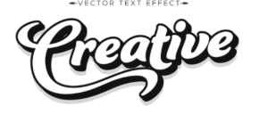
3. Script Fonts
- Mimic handwriting or calligraphy.
- Elegant, romantic, and expressive.
- Best for: Beauty brands, wedding planners, luxury items.
Examples: Pacifico, Great Vibes, Lobster
4. Display Fonts
- Bold, decorative, and designed for attention.
- Ideal for headlines, logos, and short text.
- Best for: Creative agencies, fashion brands, music artists.
Examples: Bebas Neue, Impact, Abril Fatface
5. Handwritten Fonts
- Casual and personal with an artistic flair.
- Best for: Blogs, art brands, kid-friendly products.
Examples: Amatic SC, Indie Flower, Dancing Script
Step 3: Consider Font Psychology
Different fonts evoke different emotions. Understanding font psychology helps you match your typeface with the message you want to send.
| Emotion | Ideal Font Style |
| Trust | Serif, Sans-serif |
| Fun | Handwritten, Script |
| Luxury | Script, Serif |
| Boldness | Display, Sans-serif |
| Creativity | Display, Handwritten |
Choose fonts that subconsciously reflect how you want people to feel about your brand.
Step 4: Prioritize Readability and Versatility
Graphic fonts can be gorgeous, but if they’re hard to read, they’ll hurt your brand instead of helping it.
Tips:
- Avoid overly decorative fonts for body text.
- Test fonts on different screen sizes.
- Ensure clear spacing between letters and lines.
- Use high contrast between text and background.
A good graphic font should look great on both desktop and mobile devices.
Step 5: Font Pairing: Combining Fonts the Smart Way
Most brands use more than one font—for example, one for headings and one for body copy. The trick is to pair fonts that complement each other without clashing.
Pairing Strategies:
- Combine a bold Display font with a clean Sans-serif.
- Use a Script font for logos and a Serif for readability.
- Stick to 2–3 fonts max to avoid clutter.
Popular Font Pairings:
- Montserrat (Heading) + Open Sans (Body)
- Playfair Display (Heading) + Lato (Body)
- Raleway (Heading) + Roboto (Body)
Use tools like Google Fonts or Fontpair to experiment with combinations.
Step 6: Test Fonts in Real Scenarios
Before finalizing, test your selected fonts across different platforms:
- Website
- Social media posts
- Email campaigns
- Print materials
- Mobile previews
Check how the font renders in different browsers and screen sizes. A font that looks good on desktop may not scale well on mobile.
Step 7: License Your Fonts Properly
Many graphic fonts are not free for commercial use. Make sure you:
- Read licensing agreements carefully
- Purchase the correct license (desktop, web, app, etc.)
- Use reputable font providers like Adobe Fonts, MyFonts, or Google Fonts
Avoid legal headaches by choosing licensed fonts for commercial projects.
Common Mistakes to Avoid When Choosing Graphic Fonts
- Using too many fonts: It makes your brand look inconsistent and messy.
- Ignoring your audience: Fonts must resonate with your target market.
- Choosing trendy over timeless: Fads fade. Aim for longevity.
- Neglecting legibility: Fancy doesn’t mean functional.
- Skipping mobile tests: A font that works on a billboard might not work on a smartphone.
Tools to Help You Choose Graphic Fonts
- Canva Font Combinations
- Adobe Fonts (formerly Typekit)
- Fontpair
- Google Fonts
- WhatFont browser extension
- DaFont (for decorative fonts)
These tools help preview, test, and mix fonts before committing.
Final Thoughts: Let Your Fonts Speak for You
Your brand’s voice isn’t just what you say—it’s also how you present it. Choosing the right graphic fonts can strengthen your brand identity, capture attention, and make your content more impactful.