User Interface (UI) design plays a pivotal role in creating intuitive and visually pleasing digital experiences. Within this multifaceted discipline, typography is often overlooked, yet it stands as a cornerstone of effective communication. Typographic hierarchy, in particular, is a fundamental principle that guides users through the interface, conveys information, and enhances the overall user experience. In this article, we will explore the importance of typographic hierarchy in UI design and provide insights into how to harness it effectively.
Contents
The Power of Typography
Typography is more than just selecting a font and setting text size. It encompasses the art and science of arranging type to make written language legible, readable, and appealing. When it comes to UI design, typography serves as a powerful tool for conveying information, establishing brand identity, and guiding user interactions. Proper typographic choices can significantly impact a user’s perception of a product or service.
What is Typographic Hierarchy?
Typographic hierarchy refers to the organization and prioritization of text elements within a user interface. It helps users quickly understand the content and navigate through the interface by emphasizing certain information while de-emphasizing others. A well-structured typographic hierarchy leads to a smoother user experience and can enhance the usability of an application or website.
Elements of Typographic Hierarchy
- Text Size: One of the most straightforward ways to establish hierarchy is through text size. Larger fonts tend to grab more attention and are typically reserved for headings, titles, or important call-to-action elements. Smaller fonts are used for less important or supporting text.
- Font Weight: The weight of a font, such as bold, regular, or light, can be used to create contrast and emphasize specific elements. Bold fonts are often used for headings, while regular or light fonts are used for body text.
- Font Style: Variations in font style, such as italics or underlining, can be employed to convey emphasis or differentiation. For example, italics may be used for quotes or emphasized text.
- Color: Color can play a significant role in typographic hierarchy. Using different text colors or shades can draw attention to specific elements, such as highlighting links or important information.
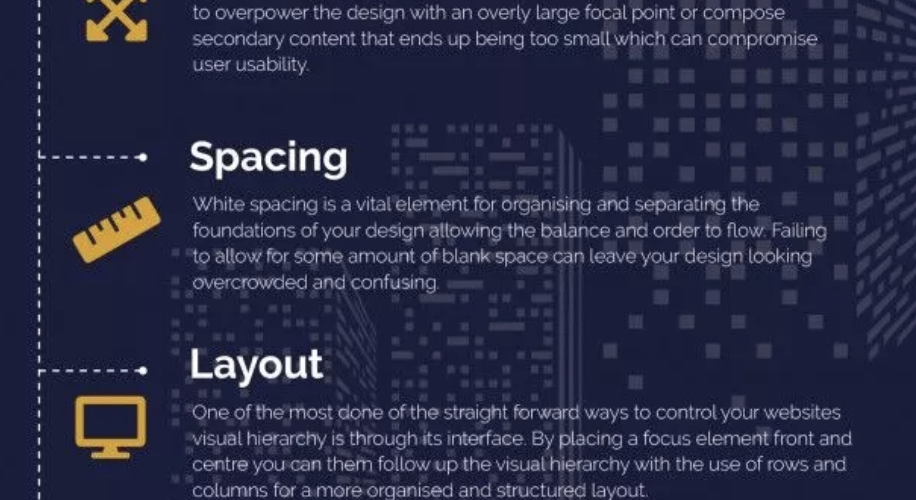
- Spacing: Proper spacing between text elements, also known as leading and kerning, affects readability and hierarchy. Adequate line spacing ensures that text is easily readable, while kerning adjusts the space between individual characters for optimal legibility.
- Alignment: The alignment of text elements within a UI can help guide the user’s eye and create a sense of order. Center-aligned or left-aligned text, for example, can evoke different feelings and convey different levels of importance.
Creating an Effective Typographic Hierarchy
- Content Analysis: Start by analyzing the content and information hierarchy within your UI. Understand what elements are most important and should be prioritized. Consider user goals and the flow of information.
- Consistency: Consistency is key to a cohesive and effective typographic hierarchy. Establish and follow a set of typography guidelines that dictate font choices, sizes, weights, and styles throughout the UI.
- Contrast: Use contrast to highlight important information. Contrast in text size, color, or font weight can draw the user’s attention to critical elements such as headings, buttons, or alerts.
- White Space: Embrace white space to improve readability and separate content. Adequate spacing around text elements helps prevent visual clutter and enhances the overall user experience.
- Testing and Iteration: Continuously test and iterate on your typographic hierarchy. Conduct user testing to ensure that the hierarchy effectively guides users and makes the interface more intuitive.
Conclusion
In UI design, typography is far more than just selecting fonts; it’s about creating a clear and effective communication system. Typographic hierarchy is the linchpin that enables designers to structure content, convey meaning, and guide users through a digital interface. By understanding the principles of typographic hierarchy and implementing them effectively, designers can create UIs that are not only visually appealing but also user-friendly and intuitive. In an age where digital experiences are more prevalent than ever, mastering the art of typographic hierarchy is essential for creating compelling and effective user interfaces.