Typography is a powerful tool in design and branding, but when it goes wrong, it can lead to some unforgettable—and often hilarious—fails. From questionable font choices to awkward kerning, typography mistakes can undermine a brand’s message, confuse audiences, and even go viral for all the wrong reasons.
In this article, we’ll dive into some of the most infamous typography fails, discuss the consequences of poor font choices, and share tips to help you avoid these pitfalls. Plus, we’ll keep things light and engaging with a touch of humor and visuals. Let’s get started!
Contents
Highlighting Typography Fails: When Fonts Go Wrong
1. The “Comic Sans” Catastrophe
- Example: In 2006, the city of Córdoba, Spain, used Comic Sans for official tourism campaign materials. The playful, childlike font clashed with the city’s historic and sophisticated image.
- Why It Failed: Comic Sans is often seen as unprofessional and inappropriate for formal contexts.
- Visual: Imagine a medieval castle poster with Comic Sans text—yikes!
2. The “Kerning” Nightmare
- Example: The logo for IT Crowd, a British sitcom, had such poor kerning (spacing between letters) that it looked like “IT C rowd.”
- Why It Failed: Bad kerning can make text hard to read and create unintended meanings.
- Visual: A side-by-side comparison of the original logo and a properly kerned version.
3. The “Papyrus” Predicament
- Example: James Cameron’s blockbuster Avatar used Papyrus for its logo, sparking endless memes and even a Saturday Night Live skit.
- Why It Failed: Papyrus is overused and often associated with amateur designs, making it a poor choice for a high-budget film.
- Visual: The Avatar logo next to a generic yoga studio flyer using Papyrus—spot the difference!
4. The “Wingdings” Disaster
- Example: In 2012, a New York government website accidentally used Wingdings (a symbol font) instead of a standard font, turning important information into indecipherable symbols.
- Why It Failed: Using a symbol font for body text is a major usability fail.
- Visual: A screenshot of the website with Wingdings text—utter chaos!
5. The “Faux Bold” Fiasco
- Example: Some brands artificially bold fonts by stretching them horizontally, resulting in distorted and unprofessional-looking text.
- Why It Failed: Faux bold fonts lack the balance and readability of properly designed bold typefaces.
- Visual: A stretched font next to a true bold font—the difference is striking.
The Consequences of Poor Font Choices
1. Damaged Brand Image
- Poor typography can make a brand appear unprofessional or out of touch. For example, using Comic Sans in a corporate report can undermine credibility.
2. Confused Audiences
- Bad kerning or hard-to-read fonts can make your message unclear. Imagine a restaurant menu with overly decorative script fonts—customers might struggle to order!
3. Lost Opportunities
- A poorly designed logo or ad can fail to capture attention, resulting in lost sales or engagement.
4. Viral Shame
- In the age of social media, typography fails can go viral, turning your brand into a meme. (Looking at you, Papyrus!)
How to Avoid Typography Fails: 7 Tips for Better Font Choices
1. Choose Fonts That Match Your Brand
- Select fonts that align with your brand’s personality. For example, a tech company might opt for a sleek, modern sans-serif, while a luxury brand might choose an elegant serif.
2. Prioritize Readability
- Avoid overly decorative or hard-to-read fonts for body text. Save them for headlines or logos if necessary.
3. Mind the Kerning
- Pay attention to the spacing between letters. Poor kerning can turn “click” into “cl ick”!
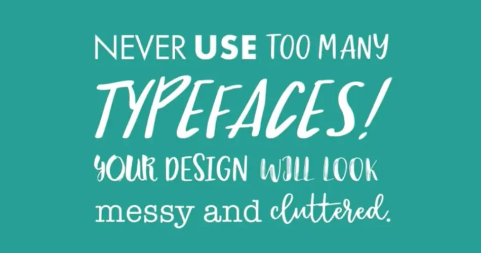
4. Stick to a Limited Font Palette
- Use no more than 2-3 fonts in a single design to maintain consistency and avoid visual clutter.
5. Test for Accessibility
- Ensure your typography is accessible to all users, including those with visual impairments. Use tools like WebAIM to check contrast ratios.
6. Avoid Overused Fonts
- Steer clear of fonts like Comic Sans, Papyrus, or Curlz MT, which are often associated with amateur designs.
7. Get Feedback
- Before finalizing a design, get feedback from colleagues or target audiences to catch potential issues.
To keep things lighthearted, here are a few more examples of typography fails that will make you laugh (and cringe):
- “Therapist” vs. “The Rapist”: Poor spacing can turn a harmless word into something entirely different.
- “Pen Island”: A website for custom pens accidentally became a viral joke due to its unfortunate URL: penisland.net.
- “Kids Exchange”: A sign for a children’s consignment store read “Kid Sex Change” due to poor line breaks.
Conclusion: Learn from the Fails
Typography fails can be funny, but they also serve as valuable lessons for designers and brands. By understanding the consequences of poor font choices and following best practices, you can create designs that are both visually appealing and effective.
Remember, typography is more than just picking a pretty font—it’s about communication, readability, and brand identity. So, the next time you’re tempted to use Papyrus or stretch a font, think twice!