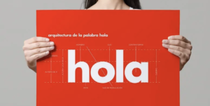
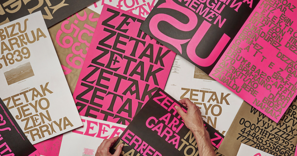
Typography plays a pivotal role in branding, creating a visual identity that can captivate and resonate with consumers. The right font choice can convey a brand’s personality, evoke emotions, and establish a sense of trust and credibility. From logo design to packaging, websites to marketing materials, typography sets the tone and communicates a brand’s message effectively.

Typography in Branding
Contents
- 1 Importance of Typography in Branding
- 2 Elements of Typography in Branding
- 3 Choosing the Right Font for Your Brand
- 4 Typography Trends in Branding
- 5 Case Studies of Successful Typography in Branding
- 6 Tips for Effective Typography in Branding
- 7 Using Typography to Evoke Emotions in Branding
- 8 Typography Mistakes to Avoid in Branding
- 9 Conclusion: The Power of Typography in Branding
Importance of Typography in Branding
Typography in branding goes beyond simply selecting a font. It involves understanding the essence of a brand and translating it into a visual language that speaks to the target audience. The right typography can differentiate a brand from its competitors and create a memorable impression. It helps to establish a brand’s identity, convey its values, and leave a lasting impact on consumers.
Legibility is a crucial factor in typography. A font should be easily readable, regardless of the medium or size. It should maintain clarity and legibility even when scaled down or used in different formats. A brand’s typography must be adaptable and consistent across various touchpoints, including print and digital platforms, to enhance recognition and recall value.
Elements of Typography in Branding
When it comes to typography in branding, several elements need to be considered. These elements work together to create a cohesive visual language that effectively communicates a brand’s message.
- Typefaces: Typefaces are the foundation of typography. They encompass various font families, such as serif, sans-serif, script, or display. Each typeface has its own personality and conveys different emotions. Serif fonts, with their decorative strokes, often exude a sense of tradition and elegance, while sans-serif fonts are more modern and minimalistic.
- Font Weight: Font weight refers to the thickness or thinness of a typeface. Different weights can be used to highlight important information, create visual hierarchy, or add emphasis. For example, a bold font weight might be used for headlines or key messages, while a lighter weight can be used for body text.
- Typography Hierarchy: Typography hierarchy is the arrangement and organization of different font sizes, weights, and styles to guide readers through the content. It helps to create visual interest, highlight important information, and improve readability. By using different font sizes and weights, designers can draw attention to key elements and ensure a smooth reading experience.
Choosing the Right Font for Your Brand
Selecting the right font for your brand is a crucial step in creating a strong visual identity. The font you choose should align with your brand’s personality, values, and target audience. Here are some key considerations when choosing a font:
- Brand Personality: Consider the personality traits you want your brand to convey. Is it modern and sleek, sophisticated and elegant, or playful and whimsical? Different fonts evoke different emotions, so choose one that aligns with your brand’s desired image.
- Legibility: Ensure the font you choose is easily readable, even in small sizes or low-resolution formats. Test the font on different devices and mediums to ensure it remains legible and clear.
- Scalability: Consider how the font will scale across various touchpoints, from small social media ads to large billboards. A font that maintains its legibility and aesthetic appeal at different sizes is essential for a consistent brand experience.
- Brand Differentiation: Look for a font that sets your brand apart from competitors. Avoid commonly used fonts that may dilute your brand’s uniqueness. Custom fonts or unique combinations can help establish a distinctive brand identity.
Typography Trends in Branding
Like any design element, typography trends evolve over time. Staying updated with the latest trends can help keep your brand visually relevant and appealing to your target audience. Here are some typography trends in branding:
- Minimalism: Clean and minimalistic typography has been a popular trend in recent years. Sans-serif fonts with simple, geometric shapes are often used to convey a modern and contemporary feel.
- Handwritten and Script Fonts: Handwritten and script fonts add a personal touch to branding. They can evoke emotions such as warmth, friendliness, or creativity. These fonts are often used by brands that want to create a more personal connection with their audience.
- Custom Typography: Custom typography allows brands to create a truly unique and distinctive visual identity. Custom fonts can be tailored specifically to a brand’s personality and values, creating a strong brand recognition.
Case Studies of Successful Typography in Branding
To understand the impact of typography in branding, let’s explore some successful case studies:
- Coca-Cola: Coca-Cola’s typography is iconic and instantly recognizable. The curvy, script font used in their logo conveys a sense of tradition, nostalgia, and classic appeal. The font has remained consistent throughout the brand’s history, contributing to its strong brand recognition.
- Apple: Apple’s typography is sleek, minimalist, and reflects their commitment to simplicity and innovation. The use of the clean, sans-serif font in their branding conveys a sense of modernity and sophistication.
Tips for Effective Typography in Branding
Here are some tips to ensure effective typography in your branding efforts:
- Consistency: Maintain consistent typography across all brand touchpoints, from your website to your social media posts. Consistency reinforces brand recognition and creates a cohesive visual identity.
- Hierarchy: Use typography hierarchy to guide readers through your content. Establish a clear visual hierarchy by varying font sizes, weights, and styles to highlight important information and improve readability.
- Whitespace: Utilize whitespace effectively to give your typography room to breathe. Whitespace improves legibility and enhances visual appeal by creating a clean and uncluttered design.
- Balance: Achieve a balance between aesthetics and functionality. While it’s important to choose a font that aligns with your brand’s personality, ensure it remains legible and functional across different mediums and sizes.
Using Typography to Evoke Emotions in Branding
Typography has the power to evoke emotions and create a connection with your audience. Different fonts can elicit different emotional responses. For example:
- Serif Fonts: Serif fonts often evoke a sense of tradition, elegance, and reliability. They can be used by brands that want to convey a sense of heritage or sophistication.
- Sans-serif Fonts: Sans-serif fonts are often associated with modernity, simplicity, and innovation. They can be used by brands that want to convey a contemporary and forward-thinking image.
Typography Mistakes to Avoid in Branding
While typography can greatly enhance your branding efforts, there are some common mistakes to avoid:
- Using Too Many Fonts: Limit the number of fonts used in your branding. Using too many fonts can create a cluttered and unprofessional look. Stick to a few fonts that complement each other and create a cohesive visual identity.
- Illegible Fonts: Avoid using fonts that are difficult to read, especially when scaled down or used in small sizes. Illegible fonts can frustrate your audience and hinder effective communication.
Conclusion: The Power of Typography in Branding
Typography is a powerful tool that can elevate your branding efforts and create a lasting impression on your target audience. By carefully selecting fonts that align with your brand’s personality, considering legibility, scalability, and maintaining consistency, you can create a strong and cohesive visual language that effectively communicates your brand’s message. Stay updated with the latest typography trends, learn from successful case studies, and implement effective typography practices to strengthen your brand’s recognition and recall value. Remember, typography is not just about aesthetics; it’s about creating a meaningful connection with your audience through visuals that resonate.
