In the vast world of design, logos play a pivotal role in representing a brand’s identity and values. A well-crafted logo has the power to leave a lasting impression on consumers and differentiate a brand from its competitors. While there are various techniques designers use to create visually appealing and memorable logos, one approach that has gained significant popularity is typography. Typography logos rely solely on fonts and typography techniques to convey a brand’s message and identity, making them a unique and powerful tool in logo design.
Typography logos
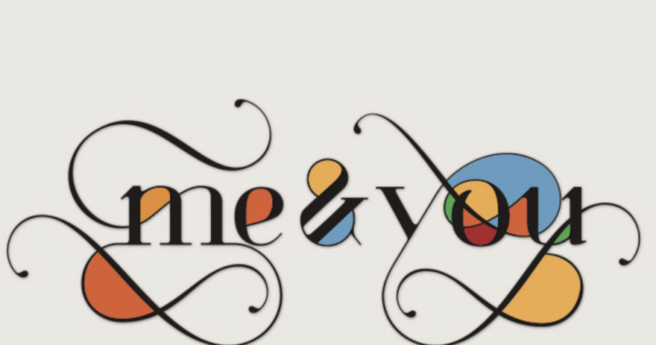
Typography logos, when done right, can evoke emotions, reflect a brand’s personality, and communicate its core values. The art lies in choosing the right font, letter spacing, and style to create a visual language that resonates with the target audience. By carefully selecting and arranging letters, designers can tell a story and create a visual identity in a simple yet powerful way. Typography logos have the ability to capture attention and establish a brand’s credibility through the artful arrangement of letters.
When designing a typography logo, it is essential to consider the overall message and essence of the brand. Typography can convey different emotions and personalities based on the font choice. Bold and strong fonts may symbolize confidence and authority, while elegant and flowing scripts can evoke a sense of sophistication and luxury. The font selection should align with the brand’s values and target audience to create a cohesive and impactful visual representation.
Contents
- 1 The Different Types of Typography Logos
- 2 Examples of Successful Typography Logos
- 3 Tips for Creating Effective Typography Logos
- 4 Choosing the Right Font for Your Typography Logo
- 5 Considerations for Color and Layout in Typography Logos
- 6 Using Negative Space in Typography Logo Design
- 7 Case Studies of Popular Typography Logos
- 8 Conclusion: The Power of Typography in Logo Design
The Different Types of Typography Logos
Typography logos can take various forms, each with its unique characteristics and design principles. Let’s explore some of the common types of typography logos:
Wordmarks:
Wordmarks are typography logos that consist of the brand name or a word representing the brand. These logos rely solely on typography to create a distinct visual identity. Famous examples of wordmark logos include Coca-Cola, Google, and FedEx. Wordmarks are often clean, simple, and memorable, making them an excellent choice for brands with short and catchy names.
Lettermarks:
Lettermarks, also known as monogram logos, use the initials of a brand’s name to create a visually appealing logo. These logos condense the brand’s identity into a few letters, making them ideal for brands with long or complex names. Examples of successful lettermark logos include IBM, HBO, and NASA. Lettermarks allow for creative typographic exploration while maintaining simplicity and recognition.
Combination Marks:
Combination marks combine typography with other visual elements, such as symbols or icons, to create a comprehensive and memorable logo. These logos offer the best of both worlds by leveraging typography and visual imagery to convey a brand’s message. Famous examples of combination mark logos include Adidas, McDonald’s, and Starbucks. Combination marks provide versatility and flexibility, allowing brands to use the logo in various contexts while maintaining consistency.
Each type of typography logo has its own strengths and considerations, and choosing the right type depends on the brand’s personality, target audience, and overall message. By understanding the characteristics of each type, designers can create logos that effectively communicate a brand’s essence.
Examples of Successful Typography Logos
To truly understand the power of typography in logo design, let’s take a look at some successful examples of typography logos:
Nike:
Nike’s logo, often referred to as the “Nike Swoosh,” is a prime example of a wordmark logo that has become iconic and instantly recognizable worldwide. The logo features a simple yet dynamic design that conveys motion, energy, and empowerment. The custom typeface used in the Nike logo perfectly captures the brand’s athletic and innovative spirit.
Disney:
Disney’s logo is a classic example of a wordmark logo that embodies the brand’s magical and enchanting world. The logo uses a whimsical and playful custom typeface that instantly transports viewers into the realm of imagination and childhood nostalgia. The carefully crafted typography creates a sense of wonder and invites audiences to experience the magic of Disney.
IBM:
IBM’s logo is a lettermark logo that demonstrates the power of simplicity and minimalism. The logo uses a strong and bold font for the initials “IBM,” emphasizing the brand’s strength and reliability. The clean and straightforward typography reflects the brand’s commitment to innovation and technology.
These examples showcase the impact typography logos can have on a brand’s identity and recognition. By carefully selecting and designing typography, brands can create logos that resonate with their target audience and embody their unique essence.
Tips for Creating Effective Typography Logos
Designing a typography logo requires careful consideration and attention to detail. Here are some tips to help you create effective and impactful typography logos:
Understand the brand:
Before diving into logo design, take the time to understand the brand’s values, target audience, and overall message. This understanding will guide your font selection and design choices, ensuring that the logo accurately represents the brand.
Choose the right font: The font you choose will set the tone and personality of the logo. Consider the brand’s industry, values, and target audience when selecting a font. Experiment with different fonts and styles to find the one that best captures the brand’s essence.
Balance legibility and creativity:
While it’s important to be creative and unique with your typography logo, don’t sacrifice legibility for the sake of aesthetics. Ensure that the logo can be easily read and understood at various sizes and in different contexts.
Pay attention to letter spacing: Proper letter spacing, also known as kerning, is crucial in typography logos. Adjusting the spacing between letters can significantly impact the overall design and readability of the logo. Aim for consistent and balanced spacing to create a harmonious and visually appealing logo.
Consider scalability:
A well-designed typography logo should be scalable without losing its impact and legibility. Test your logo at different sizes to ensure it remains clear and recognizable.
By following these tips, you can create typography logos that effectively communicate a brand’s message, resonate with the target audience, and stand the test of time.
Choosing the Right Font for Your Typography Logo
One of the most critical aspects of typography logo design is choosing the right font. The font you select will set the tone, personality, and overall visual impact of the logo. Here are some considerations to keep in mind when choosing a font for your typography logo:
Reflect the brand’s personality:
The font you choose should align with the brand’s personality and values. Consider whether the brand is modern, traditional, playful, elegant, or bold. Each font style evokes different emotions and conveys a specific message.
Consider legibility:
Legibility is key when it comes to typography logos. Ensure that the font is easy to read, even at smaller sizes. Avoid overly decorative or intricate fonts that may sacrifice legibility.
Balance uniqueness and versatility:
While it’s important for your typography logo to be unique and memorable, it should also be versatile enough to be used across various platforms and applications. Strike a balance between creativity and practicality to ensure the logo can adapt to different contexts.
Choose complementary fonts:
If your typography logo consists of multiple fonts, ensure they complement each other and create a cohesive design. Avoid using fonts that clash or compete for attention.
Consider the target audience: Understanding the target audience is crucial in font selection. Different fonts appeal to different demographics.
Consider the age group, preferences, and cultural backgrounds of the target audience when choosing a font.
Ultimately, the font you choose for your typography logo should accurately represent the brand, resonate with the target audience, and create a visually appealing and impactful design.
Considerations for Color and Layout in Typography Logos
Color and layout play a vital role in typography logo design. They can enhance the message, evoke emotions, and create visual harmony. Here are some considerations for color and layout in typography logos:
Color psychology:
Different colors evoke different emotions and associations. Consider the brand’s identity and target audience when selecting colors for your typography logo. Bold and vibrant colors can convey energy and excitement, while muted and neutral colors can evoke a sense of sophistication and elegance.
Contrast and hierarchy:
Creating contrast and establishing a hierarchy of information is crucial in typography logos. Ensure that the logo’s elements are visually distinguishable and that the most important information stands out. Play with font weights, sizes, and colors to create a visually balanced and compelling design.
Negative space:
Negative space, also known as white space, is the empty space around and within the letters of a typography logo. Utilizing negative space effectively can create visual interest and enhance legibility. Experiment with negative space to create unique and memorable typography logos.
Consistency and scalability:
Consistency in color and layout across different applications and platforms is essential in maintaining brand recognition. Ensure that the typography logo remains clear and legible when scaled up or down.
By carefully considering color and layout in typography logos, designers can create visually appealing, harmonious, and impactful designs that effectively communicate a brand’s message.
Using Negative Space in Typography Logo Design
Negative space, also known as white space, is an essential element in typography logo design. It refers to the empty space around and within the letters of a logo. Utilizing negative space effectively can create visual interest, enhance legibility, and make a logo more memorable. Here are some tips for using negative space in typography logo design:
Negative space can be cleverly utilized to create hidden symbols or images within a typography logo. These hidden elements add an extra layer of meaning and intrigue to the design, making it more memorable and engaging. Famous examples include the arrow hidden within the FedEx logo and the bear hidden within the Toblerone logo.
Enhance legibility:
Proper use of negative space can significantly improve the legibility of a typography logo. By allowing enough space between letters, words, and lines, the logo becomes easier to read and understand. Be mindful of the negative space within the letters themselves, ensuring that the counters (the enclosed spaces within letters) are well-defined and not too crowded.
Create visual balance:
Negative space plays a vital role in creating visual balance and harmony within a typography logo. By carefully considering the distribution of positive and negative space, designers can create a visually appealing and well-proportioned logo. Balance can be achieved by adjusting the spacing between letters, lines, and overall layout.
Simplify the design:
Negative space can be used to simplify the design of a typography logo, making it more clean and minimalist. By removing unnecessary elements and focusing on the essential components, the logo becomes more versatile and adaptable to different contexts.
Experiment with different arrangements:
Negative space offers endless creative possibilities. Experiment with different arrangements and configurations of letters to find the most visually intriguing and impactful design. Push the boundaries of negative space to create a logo that stands out and captures attention.
When used thoughtfully and creatively, negative space can elevate a typography logo from ordinary to extraordinary, making it more memorable, engaging, and visually appealing.
Case Studies of Popular Typography Logos
To further illustrate the power of typography in logo design, let’s examine a few case studies of popular typography logos:
Google:
Google’s logo is a prime example of a typography logo that has evolved over time while maintaining its core elements. The logo features a playful and custom typeface that reflects the brand’s innovative and fun personality. The use of bright and vibrant colors adds energy and excitement to the design, making it instantly recognizable and memorable.
Coca-Cola:
Coca-Cola’s logo is a classic example of a wordmark logo that has stood the test of time. The logo uses a unique and iconic script typeface that has become synonymous with the brand. The flowing letters and distinct shape create a sense of elegance and timelessness, reflecting the brand’s heritage and tradition.
FedEx:
FedEx’s logo is a combination mark that cleverly utilizes negative space. The logo features bold and strong typography, emphasizing the brand’s reliability and efficiency. The hidden arrow formed by the negative space between the “E” and “x” adds an element of surprise and symbolism, representing the brand’s commitment to forward movement and delivery.
These case studies highlight the effectiveness of typography logos in creating strong brand identities and recognition. Through careful font selection, creative use of negative space, and attention to detail, these logos have become iconic and synonymous with their respective brands.
Conclusion: The Power of Typography in Logo Design
Typography logos are a powerful tool in capturing attention, establishing brand identity, and communicating a brand’s essence. By relying solely on fonts and typography techniques, designers can create visually appealing and memorable logos that evoke emotions, tell a story, and resonate with the target audience. From wordmarks to lettermarks and combination marks, typography logos offer a versatile and impactful approach to logo design.
When creating typography logos, it is essential to understand the brand, choose the right font, consider color and layout, and utilize negative space effectively. By following these principles and drawing inspiration from successful case studies, designers can create typography logos that leave a lasting impression and enhance a brand’s visual identity.
Whether you’re a designer seeking inspiration or a business owner looking to enhance your brand’s logo, embracing the art of typography in logo design can unlock endless creative possibilities. Typography logos have the power to captivate, communicate, and create a visual identity that stands the test of time. Embrace the art of typography and elevate your logo design to new heights of excellence.