In the world of typography, few fonts are as iconic and ubiquitous as Times New Roman. Originally designed for The Times newspaper in 1931 by Stanley Morison and Victor Lardent, this serif typeface has since become a staple in print and digital media. However, what if I told you that Times New Roman has also played a unique role in the world of film? Welcome to the Unquiet Film Series, where the familiar font takes center stage in a captivating exploration of history, storytelling, and aesthetics.
Contents
Unquiet Film Series: The Concept
The Unquiet Film Series is a daring cinematic venture that celebrates the power of typography and storytelling. Created by visionary filmmaker Ava Rodriguez, the series consists of a collection of short films. Each of these films uses Times New Roman as a central motif. The films explore different aspects of human experience and draw on the font’s rich history and universal recognition.
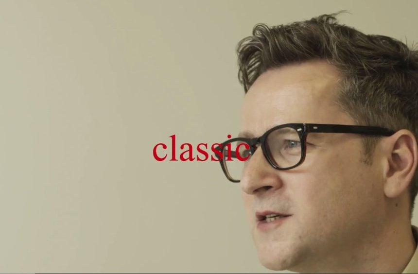
Exploring Times New Roman’s History
Times New Roman’s journey from a practical newspaper font to a symbol of classic elegance and reliability is a fascinating one. The Unquiet Film Series delves into this history, highlighting its evolution and adaptation to various mediums. Through meticulous research and artistic interpretation, Rodriguez brings to life the origins and transformations of this font. She connects it to larger cultural narratives, shedding light on its role in shaping our visual language.
The Power of Typography in Storytelling
Typography, as a visual art form, is often underestimated in its ability to convey emotion, mood, and meaning. The Unquiet Film Series challenges this perception by using Times New Roman to tell powerful and emotionally charged stories. Each film in the series showcases how the font can be a vital narrative tool, influencing how we interpret and engage with the characters and plotlines.
Times New Roman as a Character
In these films, Times New Roman becomes more than just a typeface; it becomes a character itself. It takes on a life of its own, embodying various emotions and themes throughout the series. From the stern and authoritative Times New Roman in a legal drama to the delicate and elegant Times New Roman in a period piece, the font is a versatile actor. It contributes to the depth and complexity of each story, engaging the audience on a deeper level.
Aesthetic Beauty and Cinematic Excellence
Beyond its storytelling capabilities, the Unquiet Film Series also highlights the aesthetic beauty of Times New Roman. The font’s clean lines, elegant serifs, and timeless appeal are showcased through the series’ cinematography and production design. Viewers are treated to a visual feast that honors the font’s enduring charm and showcases its versatility.
The Universal Appeal of Times New Roman
One of the remarkable aspects of Times New Roman is its universal recognition. It transcends linguistic and cultural boundaries, making it a font that people from all walks of life can relate to. The Unquiet Film Series leverages this universal appeal to create narratives that resonate with audiences on a global scale.
Conclusion
The Unquiet Film Series is a testament to the power of storytelling and typography. Through its exploration of Times New Roman, this innovative cinematic venture invites viewers to see a familiar font in a new light. It showcases the font’s rich history, its role in storytelling, and its timeless aesthetic appeal. As Ava Rodriguez continues to add new films to the series, it is clear that Times New Roman will remain an unquiet font, always ready to tell a compelling story on the big screen.