The AZ Project, also known as the Olympic Games Visual Identity by OTL Aicher, stands as a remarkable testament to the visionary design work of the renowned German graphic designer Otl Aicher. This iconic project, created for the 1972 Munich Olympics, remains a source of inspiration for designers and a pivotal moment in the history of visual identity and branding. In this article, we will delve into the AZ Project, exploring its significance, design principles, and enduring impact.
-
Contents
The Designer: Otl Aicher
Before we dive into the AZ Project, it’s essential to understand the man behind it. Otl Aicher (1922-1991) was a highly influential graphic designer, best known for his work in the field of corporate identity and design. His design philosophy was deeply rooted in simplicity, clarity, and functionality. Aicher believed that design should serve a practical purpose while also communicating profound ideas.
-
The Context: Munich 1972 Olympics
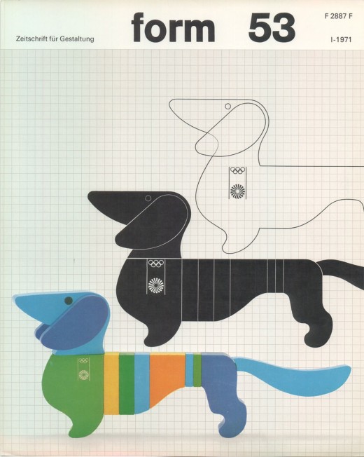
The AZ Project emerged in the context of the 1972 Munich Olympics. Germany had not hosted the Olympics since the controversial 1936 Berlin Games, and this event was an opportunity for the nation to showcase its cultural and artistic prowess on the global stage. The design of the Games’ visual identity was a crucial aspect of this endeavor.
-
Design Principles
Otl Aicher approached the AZ Project with a distinct set of design principles that would revolutionize the field of visual identity and branding:
a. Universality: Aicher aimed to create a design language that transcended language barriers. He developed a set of pictograms – simple, geometric symbols – to represent various Olympic sports, which could be universally understood by people of different nationalities.
b. Grid System: Aicher employed a strict grid system that ensured consistency in all design elements. This grid system became a hallmark of the project, providing a cohesive visual identity for the Games.
c. Color Palette: Aicher chose a vibrant, eye-catching color palette dominated by bold primary colors – red, yellow, and blue – symbolizing the diversity and unity of participating nations.
d. Typography: Aicher designed a custom typeface, the “Rotis” font, for the project. Its legibility and timeless appeal contributed significantly to the project’s success.
e. Minimalism: The AZ Project adhered to the principle of “less is more.” Aicher’s designs were clean, devoid of unnecessary embellishments, and focused on essential elements.
-
The Impact
The AZ Project had a profound and lasting impact on the world of design and branding:
a. Olympic Design Legacy: Aicher’s work set a new standard for Olympic visual identity, influencing subsequent Games, including the design of logos, mascots, and pictograms.
b. Corporate Identity: Aicher’s principles of simplicity, universality, and clarity found their way into corporate branding, influencing companies like Apple and the global design community.
c. Design Education: Aicher’s design philosophy continues to be taught and studied in design schools worldwide, emphasizing the importance of functional, timeless design.
d. Cultural Significance: The AZ Project transcended its role as a design endeavor; it became an integral part of the cultural history of the Munich Olympics and Germany as a whole.
The AZ Project by OTL Aicher for the 1972 Munich Olympics remains a beacon of design excellence and innovation. Otl Aicher’s adherence to simplicity, universality, and functionality not only contributed to the success of the Games but also left an indelible mark on the field of visual identity and branding. This project stands as a testament to the enduring power of thoughtful design and continues to inspire designers and creatives worldwide, reminding us that good design transcends time and language, speaking to the human spirit on a universal level.