In the realm of typography, the elegance and timelessness of the sans serif font truly stand out. Known for their clean lines and simplicity, sans serif typefaces have become indispensable in both print and digital design. Originating from the French word ‘sans,’ meaning ‘without,’ these fonts are distinguished by their lack of small decorative lines at the ends of the characters, setting them apart from serif fonts. This article explores the history, characteristics, benefits, and best practices for incorporating sans serif fonts in design projects, offering insights into what makes a sans serif typeface so versatile.
Contents
- 1 The History of Sans Serif Fonts
- 2 Characteristics of Sans Serif Fonts
- 3 Benefits of Using Sans Serif Fonts in Design
- 4 Popular Sans Serif Fonts and Their Unique Features
- 5 Best Practices for Using Sans Serif Fonts in Design
- 6 Examples of Successful Designs Using Sans Serif Fonts
- 7 The Psychology of Sans Serif Fonts and Their Effect on Perception
- 8 Tips for Pairing Sans Serif Fonts with Other Typefaces
- 9 Conclusion: The Enduring Appeal of Sans Serif Fonts
The History of Sans Serif Fonts
Tracing back to the late 18th century, the emergence of sans serif fonts marked a bold departure from the ornate and intricate serif fonts of the time. The simplicity and unadorned style of sans serif typefaces, such as the groundbreaking ‘Akzidenz-Grotesk’ introduced by the Berthold Type Foundry in 1896, represented a significant shift. This move paved the way for the development of other influential sans serif typeface examples like Helvetica, Futura, and Arial, each contributing to the rich tapestry of grotesque and sans serif font examples.
Characteristics of Sans Serif Fonts
Sans serif fonts are celebrated for their clean and minimalistic appearance, boasting several distinguishing features that set them apart from serif fonts. The absence of serifs, the small decorative lines or strokes extending from the characters, gives sans serif fonts a more streamlined and contemporary look. These fonts often feature consistent stroke widths, further enhancing their simplicity, readability, and clarity. The streamlined design of sans serif typefaces ensures clarity even at smaller sizes or on low-resolution displays.
Benefits of Using Sans Serif Fonts in Design
The use of sans serif fonts in design projects brings numerous advantages, contributing to their enduring popularity. Their versatility shines in various design contexts, such as logos, headlines, body text, and user interfaces. The clean lines and straightforward design of sans serif typefaces enhance legibility, especially in digital formats, appealing to a wide audience and adapting to various design styles to evoke modernity, professionalism, and elegance.
Another advantage of utilizing sans serif fonts is their adaptability across different design mediums, from print publications to websites. Their simplicity and clarity make them exceptionally effective in conveying information and ensuring ease of reading. Additionally, sans serif fonts can be easily tailored to complement various design elements, such as color, size, and spacing, allowing designers to craft visually appealing and cohesive designs that resonate with their intended audience.
Popular Sans Serif Fonts and Their Unique Features
The sans serif font family includes a diverse array of typefaces, each with its unique attributes and appeal. Notable examples like Helvetica, celebrated for its simplicity and neutrality; Arial, a versatile font often used in digital interfaces and Microsoft products; Futura, known for its geometric shapes and modern aesthetic; and Gill Sans, which offers a more humanistic touch, demonstrate the wide applicability of sans serif typefaces in various design applications, from branding to signage.
Best Practices for Using Sans Serif Fonts in Design
While sans serif fonts offer a wealth of design possibilities, adhering to best practices is essential for achieving optimal results. Selecting a font that aligns with the design goals and target audience is paramount. Considerations such as readability, legibility, and the desired emotional impact should guide the choice. Moreover, to maintain visual coherence and avoid clutter, it’s advisable to limit the use of different sans serif fonts within a single design project.
Another key consideration in design is font pairing. Sans serif fonts can be effectively paired with other typefaces, like serifs or script fonts, to create contrast and add visual interest. However, ensuring that the pairing is harmonious and complementary is essential. Experimenting with various combinations and considering factors like font size, weight, and style can help achieve a balanced and cohesive design.
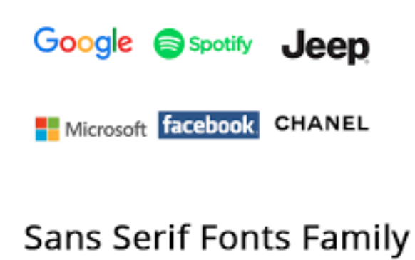
Examples of Successful Designs Using Sans Serif Fonts
Many successful designs have leveraged sans serif fonts to achieve visually compelling and impactful outcomes. For instance, Apple’s branding prominently features the Helvetica font, whose clean lines and simplicity perfectly align with Apple’s minimalist design ethos. Similarly, Airbnb’s website utilizes the sans serif font Circular, whose rounded shapes and modern aesthetic enhance the platform’s user-friendly and inviting atmosphere. These examples underscore the potential of thoughtful sans serif font usage to elevate a design and strengthen a brand’s identity.
The Psychology of Sans Serif Fonts and Their Effect on Perception
Typography significantly influences audience perception and emotional response. Sans serif fonts, often associated with modernity, simplicity, and efficiency, convey professionalism and clarity thanks to their clean lines and absence of embellishments. These fonts are frequently linked with technology and innovation, making them ideal for brands and designs in these sectors. Understanding the psychological impact of sans serif fonts enables designers to make deliberate choices that align with their design objectives and resonate with their target audience.
Tips for Pairing Sans Serif Fonts with Other Typefaces
Pairing serif fonts with complementary typefaces can create visually dynamic designs that captivate the viewer. When combining different fonts, it’s crucial to maintain the overall balance and visual hierarchy of the design. Begin by selecting a primary sans serif font as the foundation. Next, choose a complementary typeface, such as a serif or script font, to add contrast and variety. Experimenting with various combinations, while paying attention to font size, weight, and style, can lead to a harmonious and aesthetically pleasing display of text. This approach not only utilizes the versatility of sans serif fonts but also explores the rich diversity of sans serif typefaces and serif counterparts, creating a balanced and engaging visual narrative through effective font pairing.
Conclusion: The Enduring Appeal of Sans Serif Fonts
In conclusion, sans serif fonts have maintained their timeless appeal and versatility through the years. Originating as a counter-response to the ornate serif font, sans serif typefaces have evolved into a fundamental element in design across multiple mediums. Their clean lines, simplicity, and legibility make them exceptionally suitable for a wide array of text and display applications. By delving into the history, characteristics, benefits, and best practices of using sans serif fonts, designers can leverage their elegance to craft visually stunning designs that effectively communicate with the intended audience.