As a seasoned designer, I’ve come to appreciate the transformative power of typography in elevating the visual experience of any design project. One critical element that often goes overlooked, yet holds the key to unlocking exceptional design, is leading – the space between lines of text. In this comprehensive guide, we’ll delve into the art of mastering leading typography, exploring its importance, understanding the anatomy, and uncovering techniques to wield its influence effectively.
leading typography
Contents
- 1 The importance of leading in design
- 2 Understanding the anatomy of leading
- 3 Different types of leading techniques
- 4 Tips for using leading effectively
- 5 The impact of leading on readability
- 6 Leading in different design mediums – print, web, mobile
- 7 Case studies showcasing effective leading typography
- 8 Tools and resources for mastering leading typography
- 9 Conclusion: The power of effective leading in design
The importance of leading in design
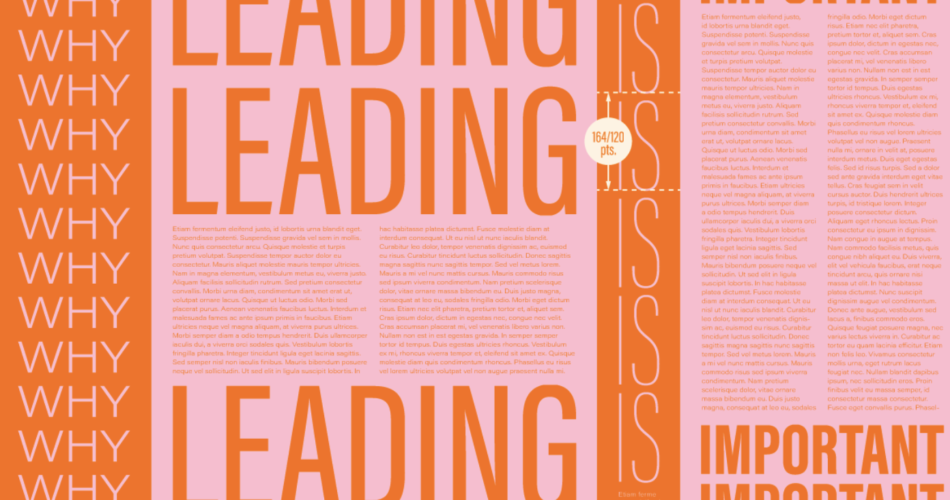
Leading, also known as line-height, is a fundamental typographic principle that directly impacts the readability, rhythm, and overall aesthetic of a design. It plays a crucial role in creating a visually harmonious and accessible layout, guiding the reader’s eye through the content. By carefully managing the spacing between lines, designers can enhance the legibility, improve the flow of information, and evoke a specific mood or tone within their work.
leading in design
Understanding the anatomy of leading
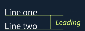
To harness the power of leading, it’s essential to comprehend its underlying anatomy. Leading is measured from the baseline of one line of text to the baseline of the line above or below it. This measurement encompasses the height of the characters, as well as the additional space between the lines. Understanding the relationship between leading, font size, and character height is the foundation for effectively implementing this typographic element.
Different types of leading techniques
While the traditional approach to leading has been a fixed, uniform spacing between lines, modern design has introduced a variety of leading techniques to cater to diverse needs and aesthetics. These techniques include:
- Absolute Leading: A fixed, consistent spacing between lines, often expressed in points or pixels.
- Relative Leading: Leading that is calculated as a percentage or multiple of the font size, allowing for more dynamic and responsive adjustments.
- Optical Leading: Leading that is adjusted based on the visual characteristics of the typeface, ensuring an optimal balance between readability and visual harmony.
- Responsive Leading: Leading that adapts to different screen sizes and devices, ensuring a consistent reading experience across platforms.
Tips for using leading effectively
Mastering leading typography requires a keen eye for detail and a deep understanding of its impact on the overall design. Here are some valuable tips to help you leverage leading effectively:
- Establish a consistent rhythm: Maintain a harmonious and rhythmic flow by using a consistent leading value throughout your design, with minor adjustments as needed.
- Optimize for readability: Ensure that the leading provides ample space for easy reading, considering factors like font size, character height, and the intended reading distance.
- Experiment with contrast: Play with varying leading values to create visual interest, emphasize specific sections, or establish a clear hierarchy within your design.
- Adapt to the medium: Adjust your leading approach based on the design medium, whether it’s print, web, or mobile, to account for different viewing conditions and user experiences.
- Leverage typographic tools: Utilize specialized tools and resources, such as font management software and CSS properties, to fine-tune and implement leading with precision.
The impact of leading on readability
The relationship between leading and readability is a delicate balance. Insufficient leading can result in a cramped and cluttered appearance, making the text difficult to parse. Conversely, excessive leading can create an airy and disconnected feel, disrupting the flow of information. By striking the right balance, designers can enhance the overall legibility and comprehension of the content, guiding the reader’s eye effortlessly through the design.
Leading in different design mediums – print, web, mobile
The application of leading typography varies across different design mediums, each with its own unique considerations and constraints. In the print realm, leading plays a crucial role in creating a comfortable and visually appealing reading experience, as the physical dimensions and viewing distance are more fixed. On the web, leading must adapt to responsive design principles, ensuring a seamless reading experience across various screen sizes and devices. In the mobile landscape, leading becomes even more critical, as users often engage with content in shorter bursts and on smaller screens, necessitating a more intentional approach to maintain readability and visual hierarchy.
Case studies showcasing effective leading typography
To illustrate the transformative power of leading typography, let’s explore a few case studies that exemplify its successful implementation:
- The New York Times: The renowned publication has long been recognized for its exceptional typography, with leading playing a pivotal role in creating a sophisticated and immersive reading experience, both in print and digital formats.
- Airbnb Design: The Airbnb design team has mastered the art of leading, using it to establish a distinct brand identity and enhance the user experience across their digital platforms.
- Kinfolk Magazine: This lifestyle publication is renowned for its elegant and minimalist design, where leading is expertly utilized to create a sense of balance, rhythm, and visual harmony.
Tools and resources for mastering leading typography
Honing your skills in leading typography requires a combination of theoretical knowledge and practical application. Fortunately, there are a wealth of tools and resources available to support your journey:
- Typography books and online tutorials: Delve into authoritative sources that dive deep into the principles of typography, including leading.
- Font management software: Leverage tools like FontBook, Suitcase Fusion, or Adobe Typekit to precisely adjust leading values and preview the results.
- CSS properties: Explore the power of CSS properties like
line-heightandletter-spacingto fine-tune leading in web-based designs. - Design software: Utilize the leading-specific features in design tools like Adobe InDesign, Sketch, or Figma to experiment and refine your leading techniques.
Conclusion: The power of effective leading in design
In the realm of design, leading typography is a true game-changer. By mastering the art of leading, designers can unlock a new level of visual harmony, enhance readability, and create designs that captivate and engage audiences. Whether you’re working on a print publication, a responsive website, or a mobile application, the principles of leading typography can elevate your work and leave a lasting impression.
Ready to take your design skills to the next level? Explore our comprehensive resources on leading typography and unlock the secrets to creating visually stunning, highly readable designs. Contact us today to learn more about our design workshops, tutorials, and personalized consulting services.